Monday, November 25, 2013

CAMPUS BEAT MIT Museum/5000 Moving Parts

John Douglas Powers, Haliades, 2012

Guest Curator: Laura Knott

The PR Buzz:  "The exhibition looks at the wide range of kinetic art being made now: from work that's concerned entirely with motion and unpredictability, to sculptures that engage with contemporary political topics, to work that brings ancient myth into contemporary life."

Recommended For: the kind of quirky inspiration you can expect from the MIT Museum

The Experience:
Less than a week since the last time, I was again hustling through chilly Central Square on my way to the MIT Museum. They must be doing something right, right?


As you turn the corner into the entrance of 5000 Moving Parts, your ears are met with the pervasive squueeeeeeeeeee! of the moving sculptures. Trust me, do not turn and walk away. Thanks to the fabulous label writing of curator Laura Knott, this sound will have a very different meaning for you by the end of the show.

The introduction rightly locates the show on a continuum from Marcel Duchamp's 1913 Bicycle Wheel and its modes of meditating and commenting on the "kinetic world of material life." The selection of works in the show eloquently demonstrate these voices of critique.

It is a good choice to begin the show with the very interactive Please Empty Your Pockets by Mexican artist Rafael Lozano-Hemmel.  This deceptively-simple illuminated conveyor belt uses a magical/mechanical form of intrusion to bond together one of the hidden spaces we all carry around with us. As Knott puts it, Lozano-Hemmer "misuses technologies of control" to relate us to each other.

A cluster of works by Anne Lilly, To Caress (which was heartbreakingly out of order), the mesmerizing Eighteen Eighteen, and To Conjugate anchor the center of the gallery. To Conjugate, with its antique fire engine fly wheels brings visitors expressively back to Duchamp's quote in the introductory text, "to see that wheel turning was very soothing, very comforting, a sort of opening of other avenues than material life of every day..."

At one end of the gallery there is a collaboration, or perhaps symbiosis might be more appropriate, between pioneer Arthur Ganson's Machine with Breath and Christina Campanella's BREATHE.  I found Campanella's soundscape of Ganson's work is worth spending some time with. Listening to the headphones as I watched Machine with Breath, the layers of mechanical rhythm expanded until they gave the impression of great physical volume and distance.  It was an uncanny sensation.

It is Knott's label writing for John Douglas Powers's seductively sinuous Haliades and deeply hypnotic Ialu that transform the dissonance of the gallery into the purposeful groan and squeal of ocean-going ships and the skirl of seabirds. Sound impossible?  Come experience it for yourself! I have to say that I have rarely experienced an exhibition in which the label text adds as much to the experience and appreciation of the objects across to board as in 5000 Moving Parts. Knott's clear and eloquent voice finds details and connections that enhance the power of the objects themselves without crowding them or coming across as overly didactic. These wonderful mini-essays are helped greatly by the placement, size and design of the labels themselves. Well done, Laura and MIT Museum!

If I have one critique of 5000 Moving Parts (other than the one sculpture that was out of order), it is that the show should have been mounted in the Epstein Innovation Gallery on the ground floor so that these works could have beckoned through the windows to the "kinetic world of material life" passing on Massachusetts Avenue.
-Vident Omnes

While You're There: See Stanley Greenberg: Time Machines reviewed by me here.


Thursday, November 21, 2013

The Concord Museum/The Best Workman in the Shop


Link to the Exhibition Website: http://www.concordmuseum.org/best-workman-in-the-shop.php

Curator: David F. Wood

PR Buzz: "The Best Workman in the Shop explores William Munroe's (1778-1861) life and career through the objects he made - including some of the most beautiful clocks crafted in Massachusetts, exquisitely crafted furniture and his detailed shop records."

Recommended For: a fall family outing to historic Concord

The Experience:
I took the kids over to the Concord Museum today to see their relatively new show on the life and work of William Monroe. I thought it a valuable fieldtrip primarily because time-telling is one skill they are learning in school and the exhibition promised an opportunity to see some very different clocks than ones they were used to seeing.

The show opened with a gallery dedicated to Monroe's period of apprenticeship during which he learned his craft. We then passed through a long (an architecturally awkward) gallery about working Concord in Monroe's day and finished with a large gallery featuring some of Monroe's more ambitious creations. Overall, the installation was concise, tidy and attractively installed.

The kids enjoyed the hands-on interactive about inlay work and we were able to then go around and (carefully) point out examples of inlay on the historic pieces.

I do wish that more could have been made of the manuscript autobiography that Monroe penned that was the source material for most of the details of his career.

One enjoyable surprise was the tall case clock in the final gallery striking the hour as we worked on our inlay patterns.
-Vident Omnes

While you're there: see From the Minute Man to the Lincoln Memorial: The Timeless Sculpture of Daniel Chester French, also very popular with my children.

Wednesday, November 20, 2013

CAMPUS BEAT: Peabody Museum (Harvard)/Translating Encounters

Plaque Depicting Chief Flanked by Two Warriors, 1550-1650, (detail)

Link the the Exhibition Website: https://peabody.harvard.edu/node/572

Co-Curators: Stephanie N Krysiak, Emily P Pierce and Drs. Diana Lauren, Peabody Museum Associate Curator, and Christina Hodge, Peabody Museum Senior Curatorial Assistant

PR Buzz: "This exhibition broadly explores the material ways in which encounters were experienced, translated, and memorialized by peoples of Europe, Africa, and the Americas."

Recommended For: a trip to the Peabody is always recommended by Vident Omnes

The Experience:
On a sunny weekday, I threaded my way through the idiosyncratic warren that is the Peabody Museum of Anthropology and Ethnolog. The inspiring noise of an enthusiastically engaged school group echoed through the halls. I eventually found my quarry.

Translating Encounters is a terrific idea on a number of levels that falls down a bit on execution. The exhibition is the product of a collaboration between two Harvard classes working with the collections of the Peabody and various Harvard library and archival holdings.  That, in itself, is a wonderful experiment that I hope is repeated in the future. The subject of the show is a fascinating topic that deserves room to be explored.

Unfortunately, room is something this show is not given. Tucked into a corner of the 4th floor galleries, Translating Encounters is difficult to distinguish from the Pacific cultures material and dioramas of Native Americans that surround it. The exhibition takes a swing at some very big ideas it doesn't ultimately have the bandwidth to deliver. This shortcoming is compounded by the inclusion of some late 19th or early 20th century African objects, such as the magnificent Kuba royal masks, whose presence in the show is not fully explained.

I found myself wishing that the true early-17th century materials that were displayed had been featured, or brought to the fore, more effectively. Among these objects are a spectacular bronze Plaque from Benin depicting a chief flanked by warriors, a remarkable Spanish (or Spanish-American?) painted leather shield, and a ceramic Jaguar Warrior figurine. The period prints, drawings and engravings were all shown in reproduction- a disappointment as surely the Harvard collections have more than a few of these in the original. An image of an elaborate 17th century celestial globe from Harvard's own collections is shown. Why not have the real thing?

In summary, the exhibition should have either been given more real estate to make its statement, or should have focused on the thoughtful juxtaposition of fewer, more original objects and artworks.

-Vident Omnes

While You're There: see the wonderfully-intalled Wiyopiyata: Lakota Images of the Contested West on the first floor just as you enter.

Jaguar Warrior Figurine 14th-16th century


CAMPUS BEAT: MIT Museum/Stanley Greenberg Time Machines

Bubble Chamber image by Stanley Greenberg

Link to the Exhibition Website: http://web.mit.edu/museum/exhibitions/greenberg.html

The PR Buzz: "New York-based photographer Stanley Greenberg has long entranced viewers with his stunning black-and-white photographs that provide unparalleled access to objects and places ordinary prople might otherwise never see- from New York's century-old water system to the hidden infrastructure of some of the world's most impressive architectural works. In this exhibition, Greenberg turns his lens on the unfailingly strange world of nuclear and particle physics."

Recommended For: a unique cross-over of art and science.


Curator: Gary Van Zante, Curator, Architecture & Design, in collaboration with Dr. Janet Conrad, MIT Professor of Physics

The Experience:
Brrrr, it's getting chilly in the Hub! I hustled along the breezy sidewalks of Central Square to the MIT Museum on Mass Ave and made my way up the stairs to the second floor galleries.  The Kurtz Photography Galleries are tucked in the far back corner, so you have to make your way through a number of other exhibitions to get to the Greenberg show. This is hardly an imposition. I got to pass through 5,000 Moving Parts, an exhibition of kinetic sculpture, while it was under installation.  It opens Nov. 21st, and I can't wait to see it.

Time Machines is attractively installed in the Kurtz galleries. Greenberg's silver gelatin prints look just right on the walls and encompass the mind-boggling array of inscrutable geometries- from retro scifi to angularly futuristic-  involved in the engineering of subatomic inquiry.  The prints are devoid of human presence so the scale of what you are looking at is often ambiguous and requires careful study to figure out.

The photographs are accompanied by fascinating, but excruciatingly small labels. Less dedicated label readers than I will miss some of the more compelling descriptions. For example; did you know that there was a neutrino observatory at the South Pole that is installed in a cubic kilometer of clear Antarctic ice? Or that Argentinian cows once upset the observation of cosmic rays? Or that a subatomic detector at Stanford was made from steel recycled from a ship sunk at Pearl Harbor because the immersion of the metal meant that it was less radioactive than new steel produced today? Or the dizzying alphabet soup of acronyms including  LIGO, TRIUMF, IceCube, CERN, ATLAS, KEK, DESY, OPERA, MINOS, LHC, KLOE, CMS, KamLAND, CEBAF, SLAC and SNO. And then if you're a really careful reader you'll also find ZEUS, which is actually a physics joke, and a reasonably funny one at that.

You  would also miss this compelling quote from Greenberg himself about film negatives used in the observation of the results of particle collisions, "Just as most physics experiments have shifted to electronic and digital representation of particle collisions, the photographic world has largely abandoned film for digital media. The idea that the photons from particles actually touched the substrate reminds me that film has an unparalleled tactility that has never ceased to work visual- and scientific- miracles."

By now, you probably get the fact that I liked this show.
-Vident Omnes

P.S. If you ask nicely at the desk, you can get a free booklet entitled Backstories: The Physics Experiments Behind Stanley Greenberg's "Time Machines"

While You're There: I bookended my visit with stops at Central Square's Mariposa Bakery and Cafe Luna, both highly recommended!

TGC Wheel, CERN, 2006


Friday, November 15, 2013

ICA Boston/Amy Sillman: one lump or two

Amy Sillman, Unearth, 2003, detail
Link to the Exhibition Website: http://www.icaboston.org/exhibitions/exhibit/AmySillman/

Curator: Helen Molesworth, Barbara Lee Chief Curator

The PR Buzz: "Through her dramatic shifts in style, sophisticated writings, and her role a the head of the painting program at Bard College's prestigious MFA program, she has proven that the basic building blocks of 20th-century painting are as relevant as ever."

You can read Sebastian Smee's laudatory and vocabulary-building review of the show here:

Recommended For: an art-induced rejuvenation on a gloomy winter's day.

The Experience:
I got to the ICA as the doors opened and made my way up to the fourth floor galleries. Sillman was not a painter I was very familiar with, so I was not really sure what I would be walking into. In the opening gallery, however, I was greeted by the compassionate and very human community of the Williamsburg Portraits (1991-92), disarmingly affixed to the gallery wall with push pins. Also in this gallery hung the killingly- and cuttingly funny Seating Chart (2006). Here was an artist, then, with a powerful connection with the messy, personal and embarrassingly honest trials of the human condition.

This unabashed, intimate voice carried through the rest of the exhibition, through grand-scale canvasses and ephemeral sketch work alike. In an introductory video on the ICA's website, Sillman describes her "devotion to a procedure of transformation."  The effort behind that devotion is evident in every clearly-defined brushstroke of her work. I came out of the show refreshingly validated for all my own foibles and neurotic idiosyncrasies- a rare accomplishment for an art exhibition.

A few works glowed in my mind after I left the show. Among them the regal Regarding Saturna (2003), the fearless series Shape that Stands Up and Listens (2012), the provocative juxtaposition of Sillman's "memory paintings" of romantic couples she was acquainted with and the abstract works those paintings engendered, and the pairing of the painting #841 with the digital print #841 that probes the very essence of painting.
Regarding Saturna, (2003)
The installation is what I'd call Contemporary Traditional- voluminous white boxes hung sparsely with work. The choice is  appropriate for much of Sillman's bold and vibrant work.  The labels are  discrete and low- to the point that I found them something of a challenge to read. One wall-sized installation of 30 drawings was somewhat compromised by the reflections of the walls and lights on the glazing in the frames. I understood from one of the gallery attendants that the glazing was stipulated in the loan of the works from the Brooklyn Museum and it is, in my opinion, a real shame that the drawings could not be allowed to "breathe." The sequence of Sillman's works through the show is loosely chronological.

After exiting the show and contemplating for a moment, I turned around and went through the show again from back to front, starting with the raw and insistent Draft of a Voice Over for Split Screen Video Loop (2012), and finishing with the camaraderie of the Williamsburg Portraits. And do you know what? I found the sequence of works even more satisfying in that direction! If you go through a chronological show backwards, does it become a show about memory?

While You’re There: See the soul-scouring LaToya Ruby Frazier: Witness, curated by Dean Daderko, Curator of the Contemporary Arts Museum Houston, and introduced by Anna Stothart, ICA Boston Curatorial Associate

Thursday, November 14, 2013

Boston Athenaeum/Collecting for the Boston Athenaeum in the 21st Century

William McGregor Paxton, Elizabeth Vaughan Okie, ca. 1895


Link to the Exhibition Website: http://www.bostonathenaeum.org/node/1856

Curator: David Dearinger, Susan Morse Hilles Curator of Paintings and Sculpture and Director of Exhibitions

PR Buzz: Collecting for a New Century: Paintings and Sculptures is the first in a series of four exhibitions that will be held in the Athenæum’s Norma Jean Calderwood Gallery between 2013 and 2018. Respectively, these exhibitions will focus on paintings & sculpture; rare book; maps; and prints & photographs. Collectively, they will celebrate the Athenæum’s continuing commitment to scholarship, preservation, and the dissemination of knowledge as represented by its extensive collections of rare and unique materials.

Recommended For: a mid-morning escape on Beacon Hill

Experience:
Collecting for a New Century is a fascinating assemblage of objects acquired by the Athenaeum since 2000. Dearinger has arranged the show into a neo-classical sequence of portraiture, figural work, landscape, still life, cityscape and genre works. He has also penned a thorough guide and checklist which makes for good reading after having seen the exhibition. When I visited the cozy galleries on the first floor of the Perkins mansion, I was the only one viewing the show which allowed me to take my time and intimately take in a selection of works with surprising emotional range.

In my own mind, a few of my favorite works rearranged themselves into a new set of categories. 

There was the Curiously Intriguing, encompassing Enrico Meneghelli's Studio Interior (1879) and Picture Galleries, the Museum of Fine Arts at Copley Square (1877), David D. Neal's Winter Fishing on the Charles River (1857) and Russell Smith's Study for the Drop Curtain of the Boston Theatre (1864).

The Delicately Beautiful, with William Trost Richard's Breakers and Dunes (ca. 1885) and Maurice Prendergast's Telegraph Hill, Nahant (1896-97).

The Surprisingly Emotional, featuring John Sloan's defiant Miss Boston (1935), William McGregor Paxton's effusively romantic Elizabeth Vaughan Okie (ca. 1895) and Alexander Brooks's warmly affectionate Going, Going, Gone (Peggy Bacon) ( n.d.).

And then there was the Downright Funny, with Polly Thayer's Shopping for Furs (1943), George Deem's George Washington and His Portrait (1972) and Peter Lyons's Kaleidoscope (2011).

A small show to be sure, but one you will be happy you saw.

-Vident Omnes

Wednesday, November 13, 2013

Isabella Stewart Gardner Museum/The Inscrutable Eye: Watercolors byJohn Singer Sargent in Isabella Stewart Gardner’s Collection

A Tent in the Rockies, 1916

Link to the Exhibition Website:  http://www.gardnermuseum.org/collection/exhibitions/current_exhibitions/inscrutable_eye

Co-Curators: Oliver Tostmann, William and Lia Poorvu Curator of the Collection, and Associate Curator Anne-Marie Eze

The PR Buzz: "This exhibition offers a look at the vibrant watercolors Sargent made for his own pleasure that were avidly collected by Gardner towards the end of her life. With their brilliant technique and fresh colors, these pictures reveal the stupendous quality of Sargent's draftsmanship"

Recommended For: More Sargent goodness, just steps away from the show at the MFA

The Experience:
I found The Inscrutable Eye something of a tease. It had a number of intriguing elements that did not hang together as a coherent experience for me. Instead of reciting my frustrations, let me tell you how I wish I had seen the show.

The first thing I should have done is get the exhibition brochure, available inside the gallery, and retreated back out to the Spanish Cloister. I then would have read the concise and eloquent essay, A Singular Friendship, by Associate Curator of the Collection, Anne-Marie Eze, while relishing in the moody passion of Sargent's El Jaleo. Once I'd finished the essay, I would return to the Fenway Gallery to take in the selection of watercolors on display.  I would have started with the Italian views on the left and then worked my way around to finish with the case of letters and ephemera.

For me, there were two standout works in the show. I was stunned by the delicately glowing A Tent in the Rockies. Sargent's ability to capture the play of bright sunlight on the exterior and interior of the canvas tent is truly masterful. Finally, there is the tender and heartbreaking Mrs. Gardner in White, a picture made all the more poignant if one has read Ms. Eze's essay.

After taking in this show, and the MFA show, the Sargents hung in the adjacent rooms of the palace leapt off the walls for me without needing to resort to the room guides.

As I left the museum back into the chilly Fenway, I found myself wondering, "Why was it called The Inscrutable Eye?"


-Vident Omnes

Mrs. Gardner in White, 1922
While You’re There: See Sophie Calle: Last Seen, the art of the unhealed wound.

Tuesday, November 12, 2013

MFA/John Singer Sargent Watercolors

Bridge of Sighs, 1903-04, courtesy of the Brooklyn Museum
Link to the Exhibition Website: http://www.mfa.org/exhibitions/john-singer-sargent-watercolors

Co-Curators: Teresa Carbone, Andrew W. Mellon Curator of American Art from the Brooklyn Museum and Erica Hirshler, Croll Senior Curator of American Painting from the MFA

The PR Buzz: "A triumphant show combines the two best collections of John Singer Sargent's dazzling watercolors."

John Singer Sargent Watercolors, a collaboration between the MFA and the Brooklyn Museum, opened in Brooklyn in April of this year and was on view there until July.  It was greeted with rapturous reviews by the NY media such as the New York Times, the New Yorker and the Wall Street Journal.

Recommended For: an adult excursion to take advantage of a rare opportunity to see an assemblage of exceptional works by a true master of the medium and giant of American art.

The Experience: 
On a chilly November morning, I hurried to the MFA to try and get in before the crowds built up. Watercolors are most rewarding when viewed intimately and a crowded gallery can really impact the gallery experience. Did it work? Not as well as I might have hoped. A crowd of others waited at the Huntington St entrance for the doors to open and most of them, it seemed, had the same destination as I.

As I descended the steps from the Shapiro Courtyard, I was greeted with a really stunning video wall installation of blending detail views of works in the show.  The effect was vibrant and welcoming and brought more than a few people to a stop to enjoy the display.

Turning the corner through the glass doors brought me into a moody blue room hung with exquisite Venetian views.  I had arrived.

The works themselves, it's fair to say, should get top billing in any review: they are exceptional. Sargent's hand is free, immediate, effortless, liquid, his composition stunning.  The works are, at their best, works of genius. The opportunity to see this number of fragile Sargent watercolors together is extremely rare and this show gives what is perhaps a once-in-a-lifetime chance to really appreciate this period of Sargent's life as an artist.

The works are hung grouped by subject matter, an organization that allows the visitor to easily relate adjacent works to each other.  I was surprised sometimes, when I checked the dates of the works, to see the wide span of years over which Sargent would paint works of similar subject matter or composition. The themes are presented in the following order as one moves through the show- In Venice, Arab Encounter, Lying Down, Mountain Heights, Portraits at Hand, Watercraft, At Work, Villa Gardens, the Knoedler Exhibitions and finishing with Sunlight on Stone. Each gallery contained a rich and rewarding selection of paintings.

In short, I loved the works. I did not love the installation. Other than the video wall outside the galleries, there was no big opening visual statement heralding the show. Even as one entered In Venice, the title label for the show was crammed awkwardly in a corner to your left. Too often, the sectional theme signage ended up behind your shoulder as you entered a gallery. The Knoedler Exhibitions section, with its fascinating insight into Sargent's relationship to the art world of his day and the genesis of the remarkable Brooklyn Museum and MFA holdings of his watercolor work, was shunted off in a dead-end appendix gallery. The visually-rich and captivating video demonstrating Sargent's technique in action was far too easily passed by. The loudest visual statement in the closing gallery Sunlight on Stone was the glass door into the lobster trap-like boutique shop dedicated to the exhibition.

My quibbles over the installation aside, John Singer Sargent Watercolors is a not-to-be-missed treasure for American art and painting lovers alike.

While You’re There: See Michelle Finamore's Think Pink, a delightful boutique show with a great installation! See the website here.

Some of My Favorites:
Early, but not early enough!


Bedouin Women, 1905-06
Poperinghe: Two Soldiers, 1918
Simplon Pass: The Green Parasol, about 1911
Spanish Soldiers, about 1903
Unloading Plaster, about 1908
La Biancheria, 1910


Monday, November 11, 2013

deCordova/Red, Yellow and Blue


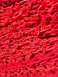
Installation by Orly Genger
Link to the Installation Website: http://www.decordova.org/art/exhibition/red-yellow-and-blue

The PR Buzz: "The miles of crocheted and layered rope articulate the topography of the sculpture park, reference the familiar low-lying stone walls that line the New England countryside, and offer fresh opportunities to engage with the landscape."

This installation was originally commissioned by New York City's Madison Square Park Conservancy and was on view there, in a very different configuration, during the summer of 2013. An in-depth review of this work, and Orly Genger's career, can be found here.

Recommended For:  Red, Yellow and Blue is a weighty, delightful, adventurous work that is well worth the journey to Lincoln.

The Experience: 
I went to see the Red, Yellow and Blue installation by Orly Genger at the deCordova in Lincoln.  It was a crisp November afternoon with bright watery sunlight.  The drive to Lincoln was lovely as always and turning into the park, I could see the red of Red, Yellow and Blue running up the hillside behind the stylish entry kiosk. We parked and headed back through the grounds to the site of the installation.  I say we, because I brought my children along with me, something I encourage anyone with children to do. It strikes me that Genger’s work has an implicit child-like impulse to it and experiencing the adventure of Red, Yellow and Blue vicariously through my children added greatly to the experience. “Follow it!” called one of my children, and follow it we did up from the lower grounds, over the rocky outcropping at the top of the ridge and down the other side to where the blue end tailed off near the forest. 

The installation did not “reference the familiar low-lying stone walls that line the New England countryside” for me, but there was a wonderful gnarled tactility of the massed of rope that did feel very true to the New England aesthetic.  The vivid colors of the installation referenced by the title, harmonized interestingly with the colors of the Massachusetts foliage- an echo made particularly poignant in the fading natural colors of late autumn. This drives me to mention that Red, Yellow and Blue will be on view at the deCordova for a year and I am eager to make return visits in other seasons. 

Genger’s choice of rope as a medium gave the added appeal that the installation rewards experience from close up as well as from far away.  From a distance, the work flowed softly and organically across the grounds. However, when I stood close, the stiff and fibrous texture of the rope gave a spiky counterpoint to the smooth curves of the overall work. Moreover, as I got close, the sheer weight of the deliberately piled walls made its presence felt- particularly in the red section where the barrier rose high over my head.

-Vident Omnes

While You're There: While there, take in the 2013 deCordova Biennial.  However, be warned that this is far less child friendly.  My hopes of viewing this in the same trip were dashed as one of my children started to de-install Laura Bracialle’s whimsical Rods and Cones. Deciding to quit while ahead, I gathered us up and headed back to the car after a very satisfying visit.

First Blush

How to begin, then? This November, I hope to get to the Sargent show at the MFA, the other Sargent show at the Isabella Stewart Gardner, the Amy Sillman show at the ICA, the Impressionists on the Water show at PEM, in Salem, the Collecting for the 21st Century show at the Boston Athenaeum, the [remastered] gallery installation at the Worcester Art Museum and Orly Genger's Red, Yellow and Blue installation at the deCordova in Lincoln. That should prove if I can chew what I've bitten off.

Once I've gotten these shows under my belt, I will go hunting among the various campus-based museums in the area, as well as some of the less-prominent (but no less wonderful) museums scattered around greater Boston.

-Vident Omnes

The Goals of See It All


I love exhibitions. As a life-long museum junkie (and 20-odd year museum professional), I've seen hundreds- probably thousands of exhibitions at museums all over the world, and I've been on the creative side of a fair few as well. A constant fascination for me has been the experience of an exhibit. Aside from the real or claimed merits of the objects and content on view, what is the show like to the visitor walking through it. Is it clear? Are the objects presented effectively? Does the supporting content enhance or distract from the overall experience? And lastly, who is the exhibition for?

And then there's the Boston-area. I love that too. A wonderful, intellectually-vibrant community with an impressive (but manageable) portfolio of large and small museums that present a kaleidoscope of exhibitions year in and year out. A fantastic environment for the avid museum-goer.

One resource I've always longed for was a centralized overview of what was going on in museum galleries around the area. Sure, there are various newspaper and online listings- typically in excruciatingly small print- that might carry a one- or two sentence plug for the show. But how about a survey of highlights that gave a slightly more in-depth description of what one could expect to see? It is into this breach that I hope to step.

-Vident Omnes